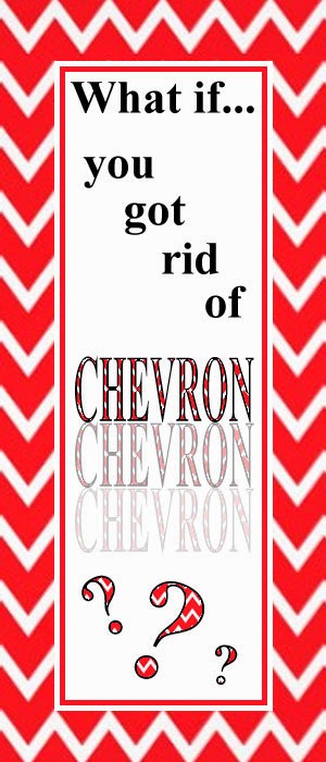
I know it might feel like a sacred cow of product covers, but I’m going to suggest it…get rid of the chevron designs around your covers.
Everyone has chevron.
Ev.
er.
y.
one.
How could you design your covers to float above the chevron ocean?
And what about the borders and frames?
I’ll bet when you get rid of the chevron, borders, and frames, your topic titles will pop more on the product covers, if nothing else because you have more cover real estate to use for the titles. The TpT mall is a bunch of store windows, right? As we’re skimming through all the search results, so many of the product covers just disappear from our focus because they’re:
- too busy,
- too small,
- too similar,
- and too not-our-style.
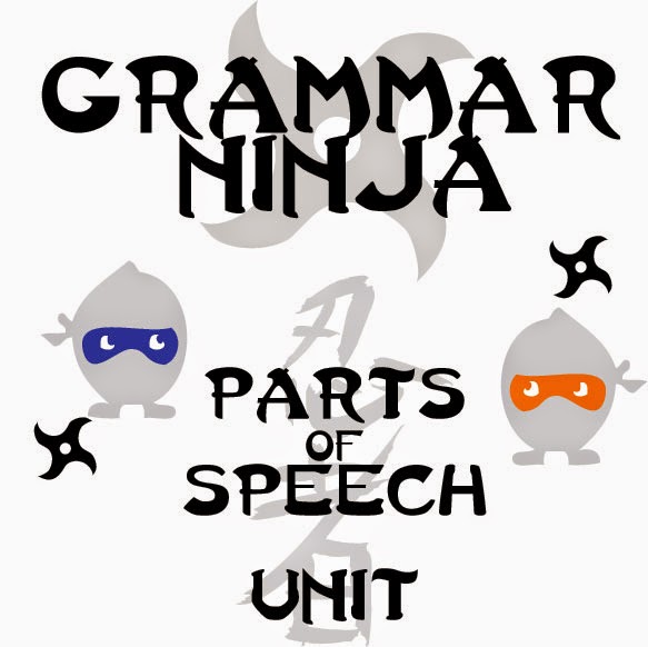
Here’s a sample search for “Parts of Speech,” a topic we have a grammar unit on. Our resources aren’t for 20-25 down the list, but scan through the images and think about these questions:
- Which images make you stop and look closer?
- While skimming without looking too closely, which words on the page make you read them?
- Which ones look different from the rest?
- Which images or designs POP off the page at you?
- Which ones grab your target audience’s eye (not just your eye)?
This is a screenshot from this TpT search: https://www.teacherspayteachers.com/Browse/Search:parts%20of%20speech
We’re obviously biased and our cover isn’t perfect at all, but we feel like our cover must be catching people’s attention in some ways.
Consider (1) how far down it is in the search, (2) its higher price than the previous resources, (3) its number of reviews compared with previous resources. It must be doing something right to grab people’s attention and keep it, getting them to click into the item and our store.
Here’s a lower grade store that we think is designing some pretty awesome stand-outty covers: Everything Just So. Check out the difference she’s made with her attractive item covers.
See what we mean? Clean. Effective. Very little chevron or borders. And here’s the kicker…the images actually have some space now to tell a story and they let you read the words. Very good stuff here.
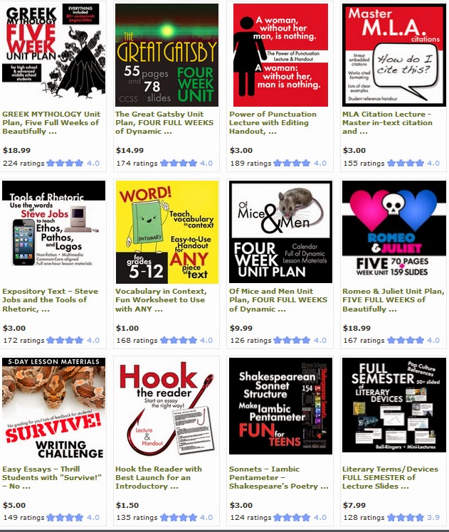
And let’s look at one of our fellow secondary ELA friends, Laura Randazzo. We <3 her product designs and ideas. Take a gander at the modern-ness of her designs:
Look at each image and really pay attention to the kinds of things your eye looks at first, then second, then third. How does the strategic image layout manipulate your eye to “read” the product cover? Laura nails it every time. Okay, maybe sometimes she uses a few too many words for our taste, but (1) you CAN READ her words and (2) she’s been rocking the Pinterest world lately, so we could all learn something from her innovations.
So here’s your Independent Practice today, teacherpreneurs…
Search for one of your topics and study the covers you see in the search results. Then, post your thoughts and discoveries and responses in the comments so we can all learn from each other.


